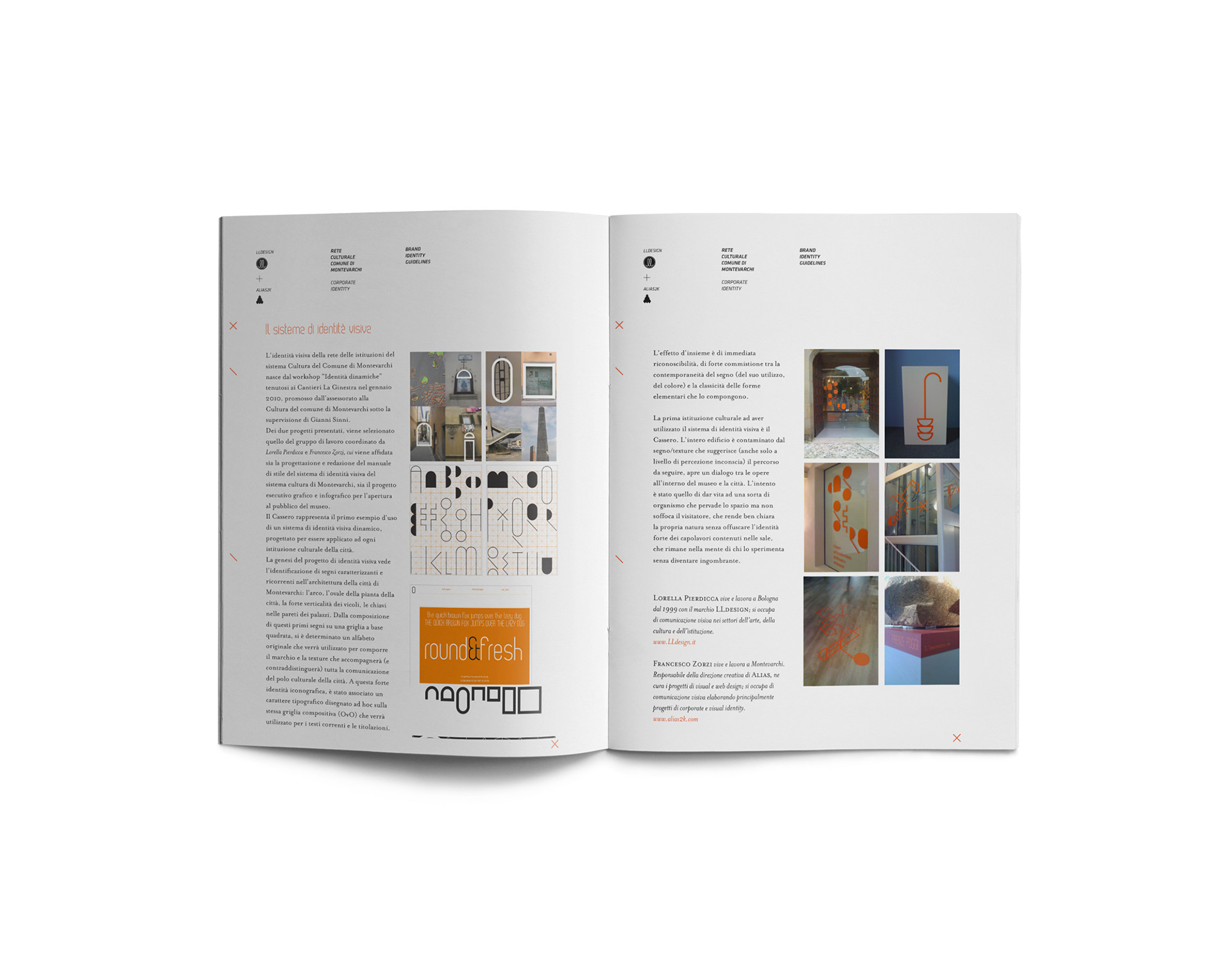
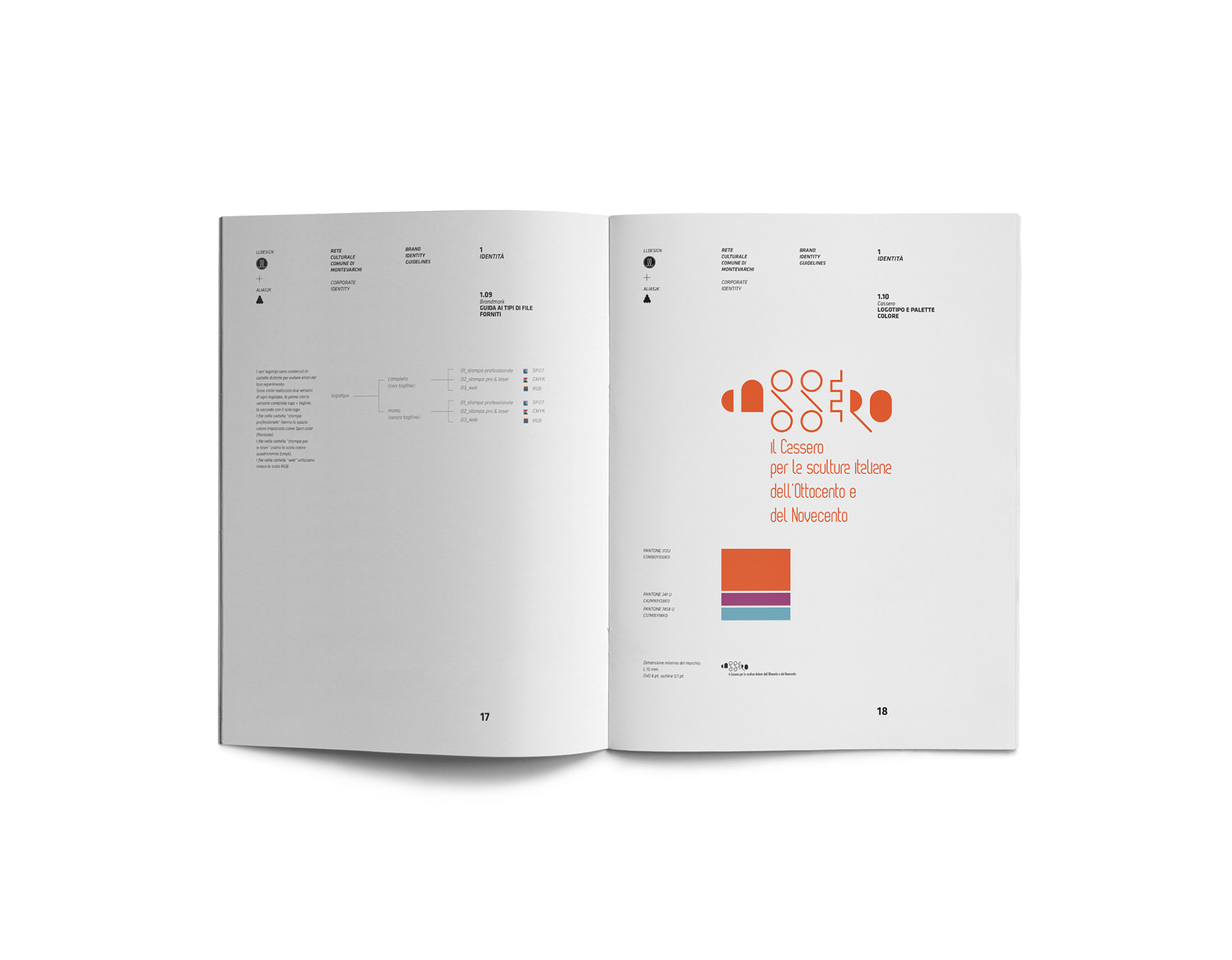
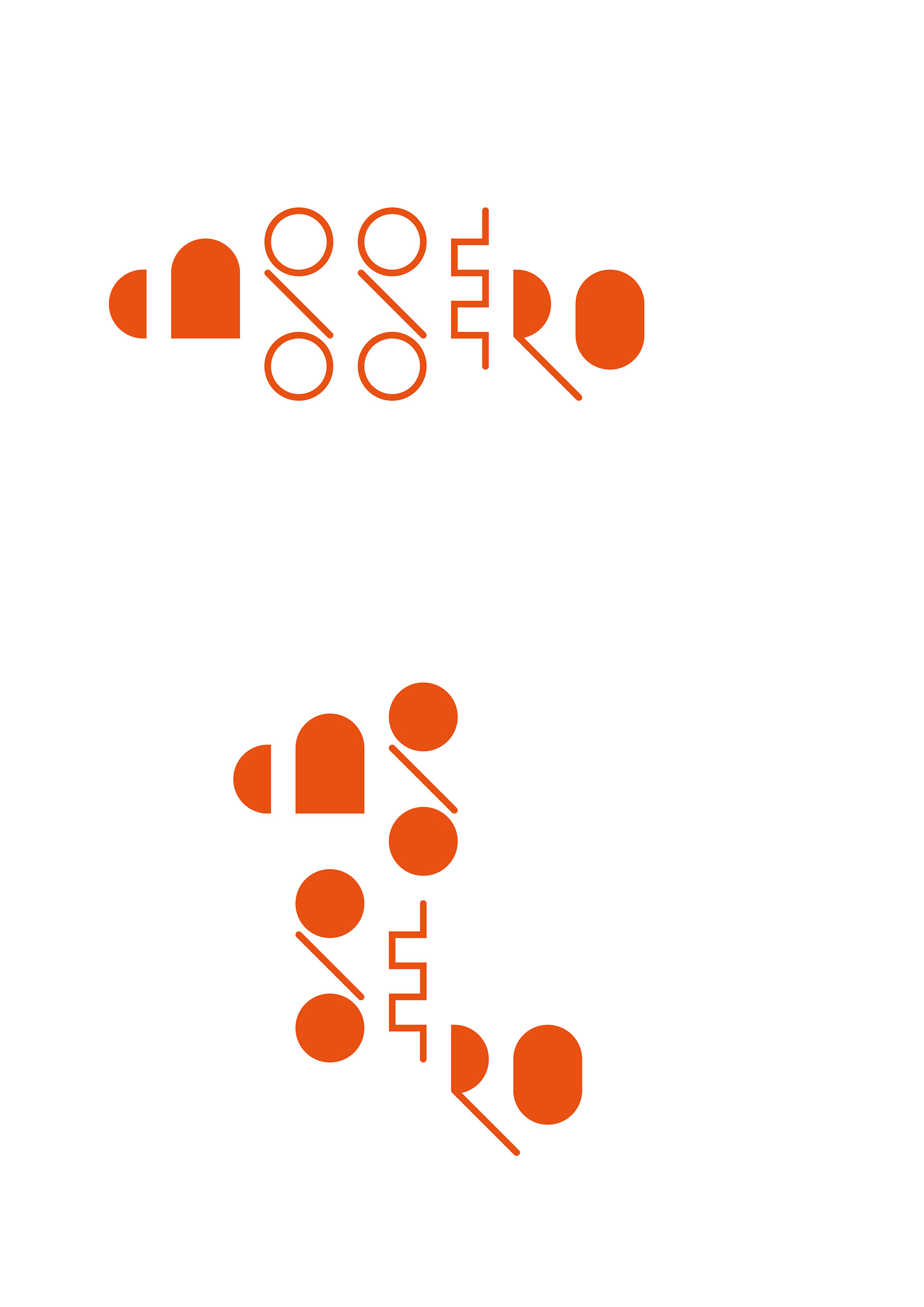
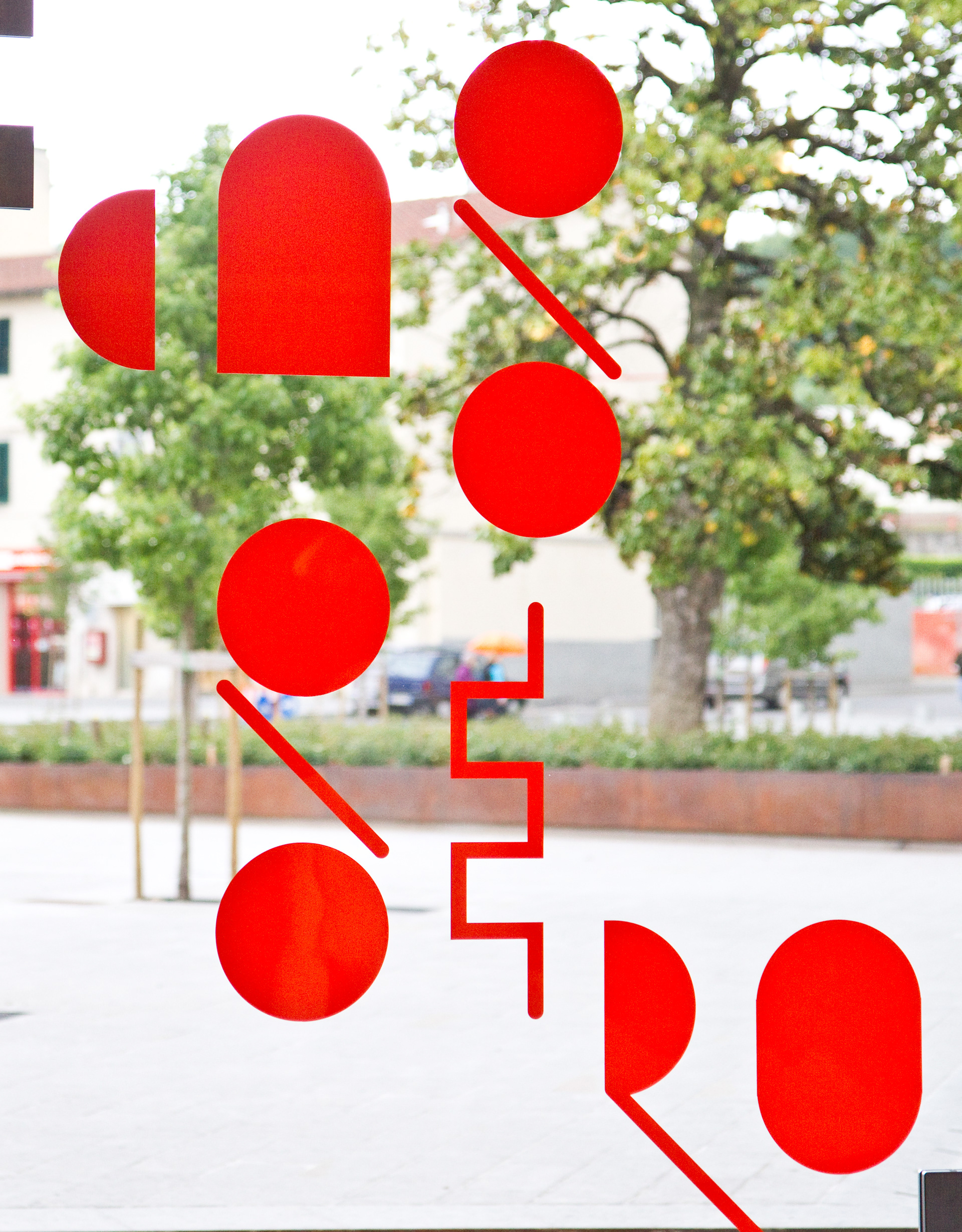
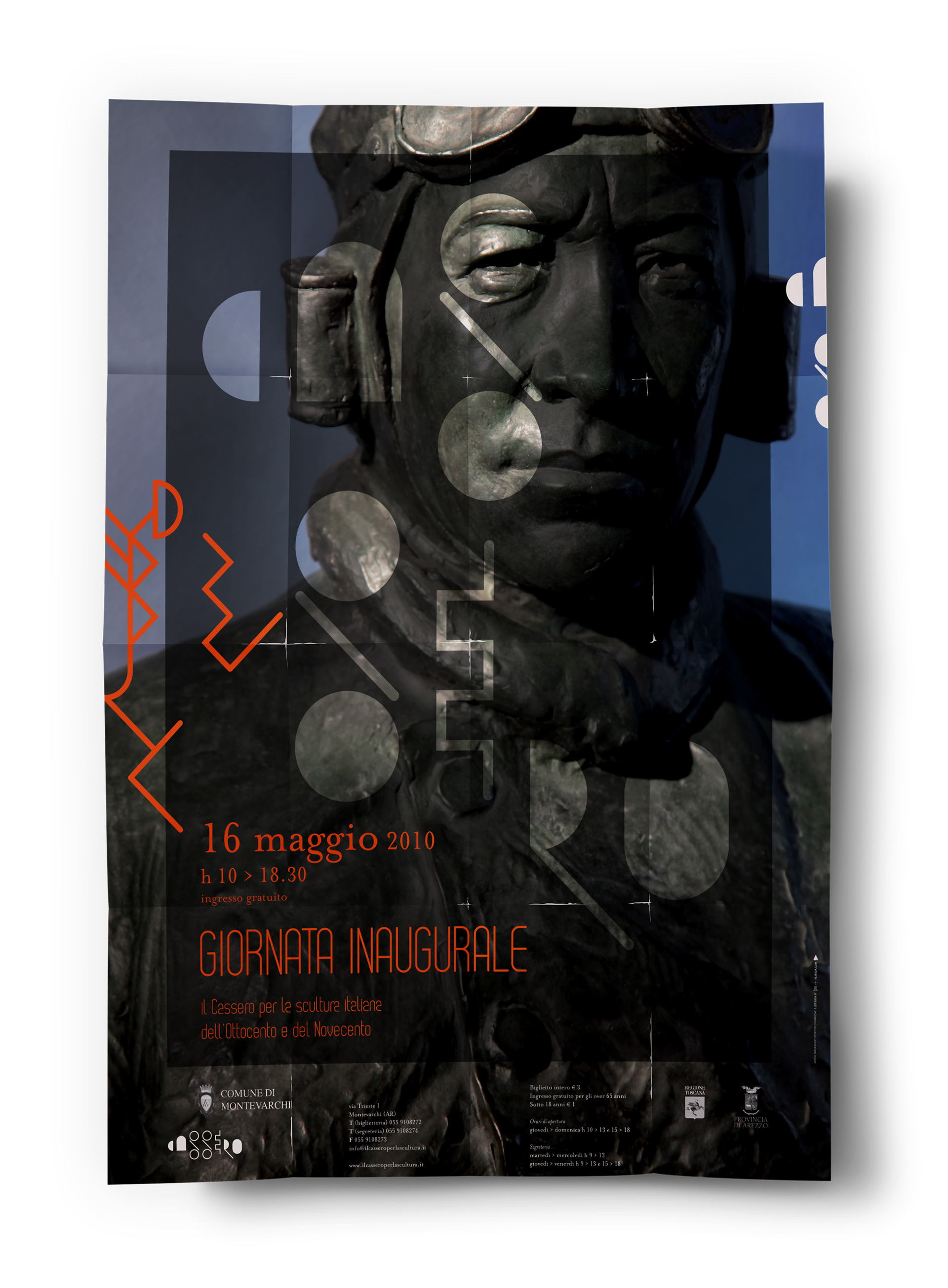
The visual identity of the Cassero began to take shape during the ‘Dynamic Identities’ workshop held at the cultural centre ‘La Ginestra’ in Montevarchi, Italy. The winning project was designed by Francesco Zorzi and Lorella Pierdicca, and went on to be developed in preparation for when the museum was opened to the public.
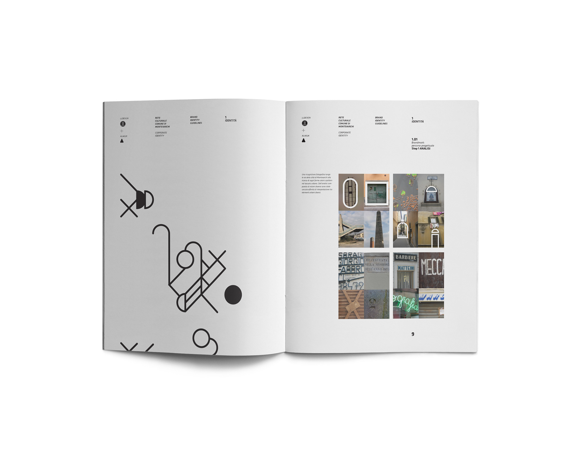
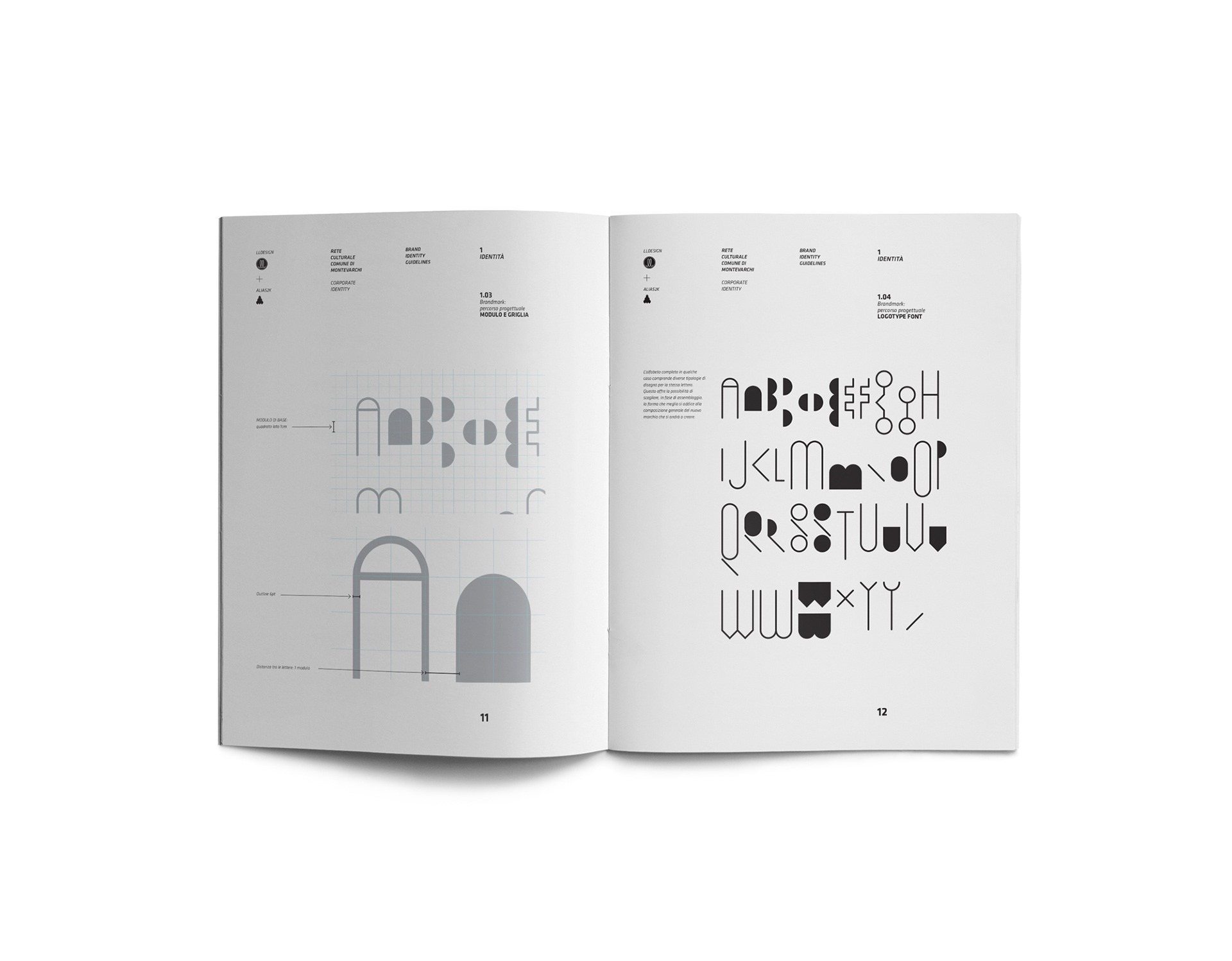
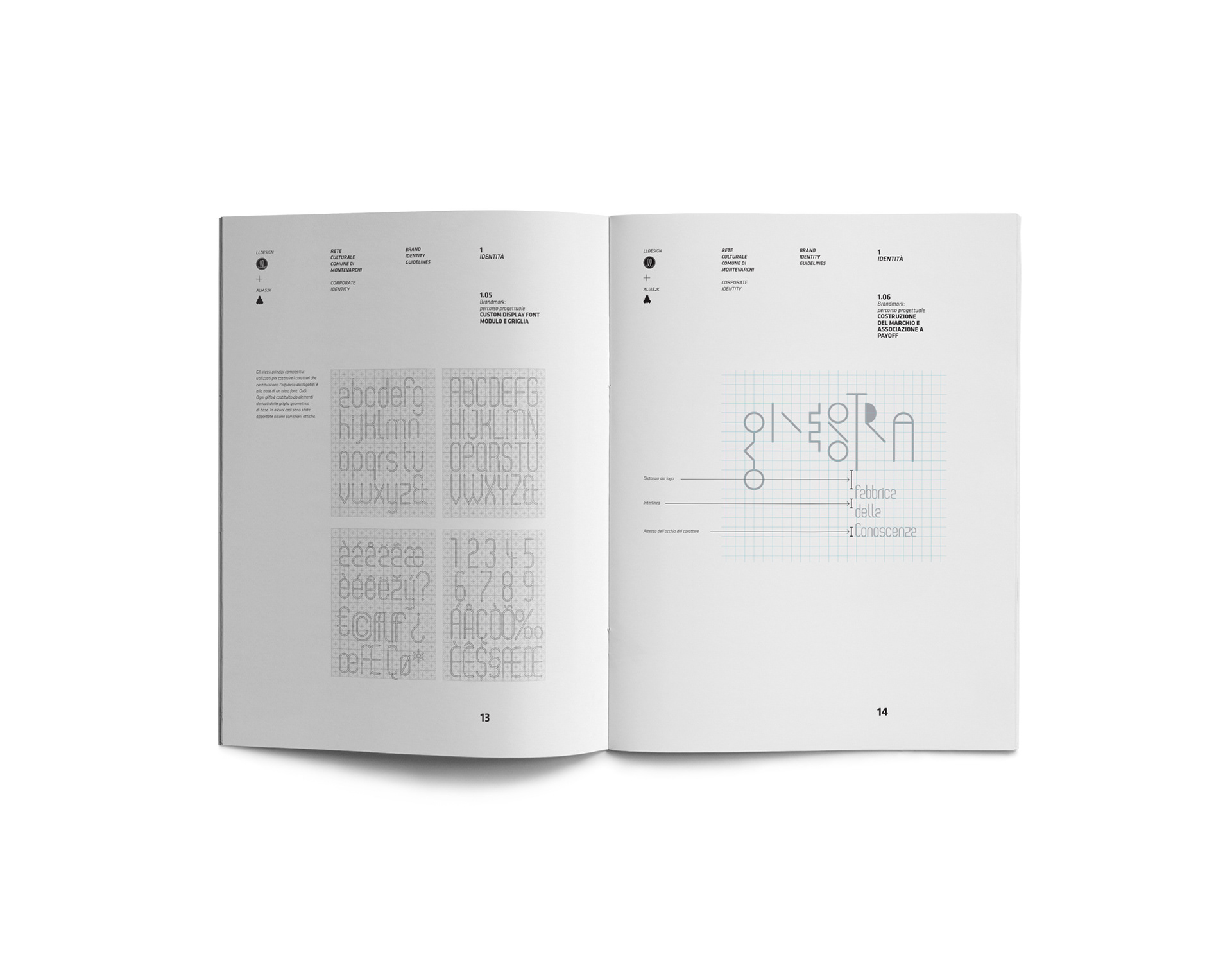
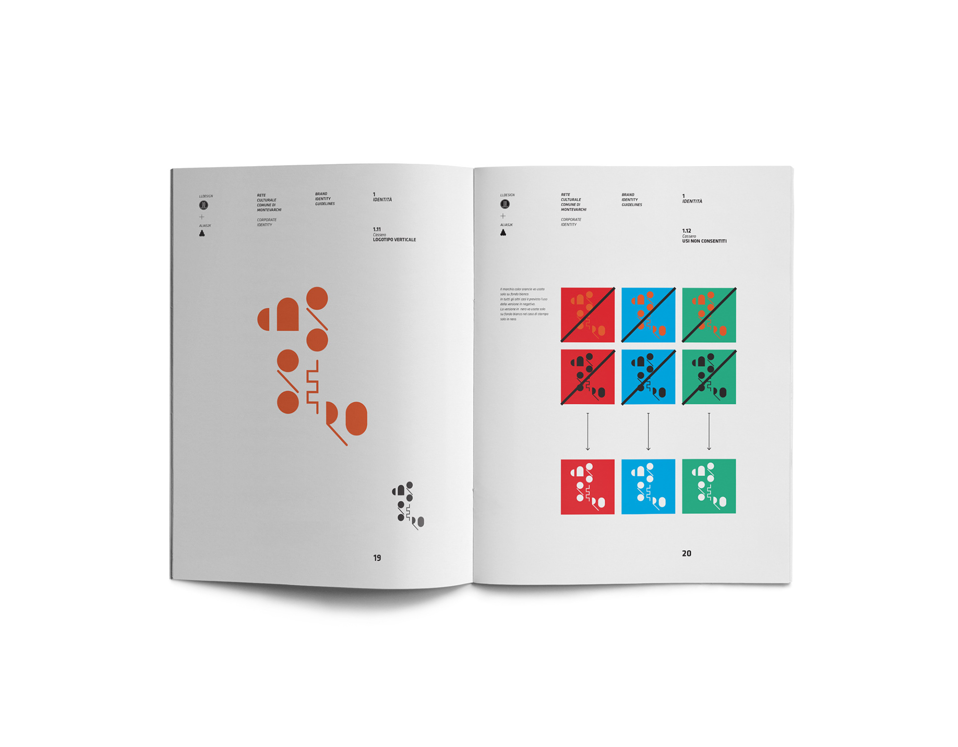
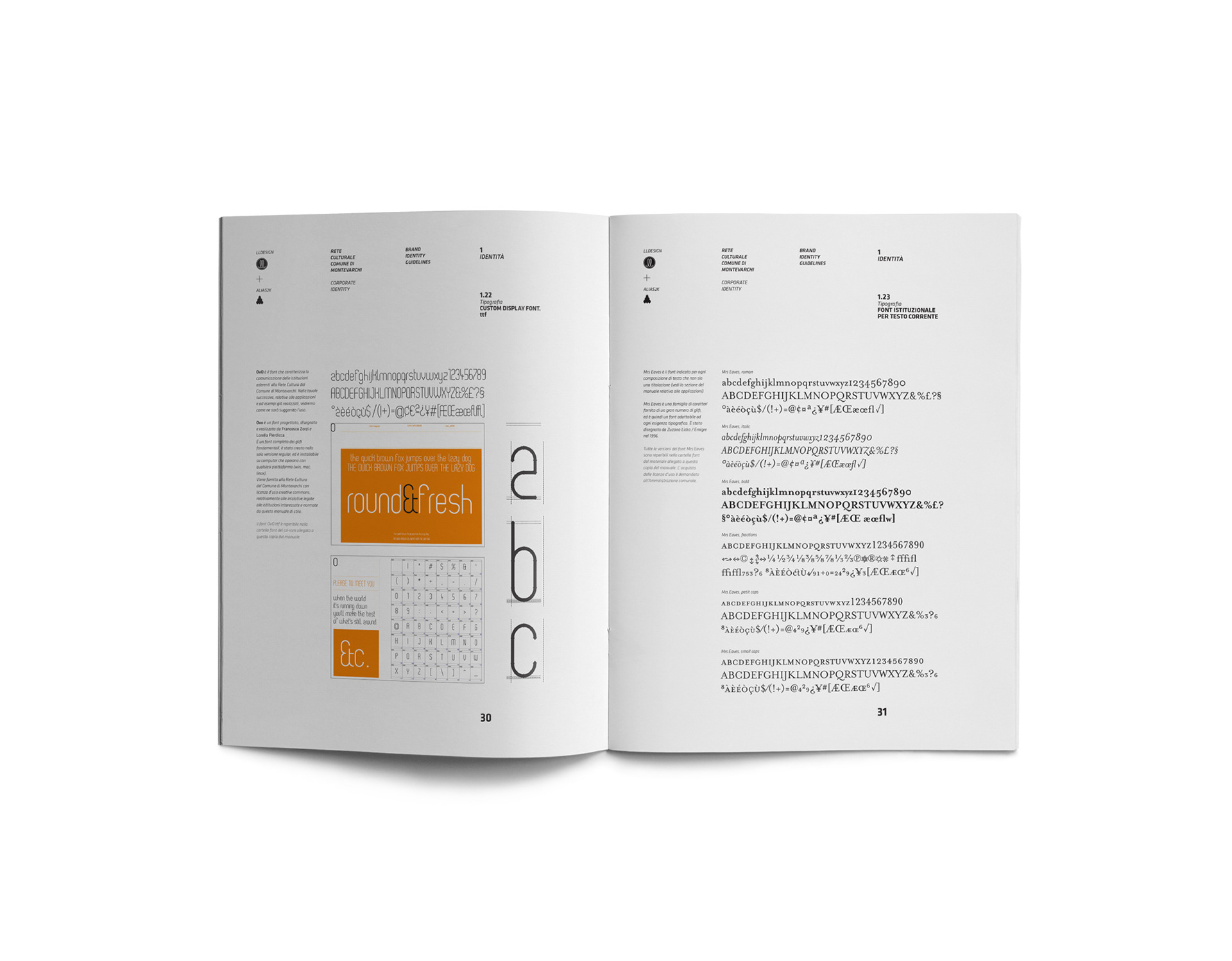
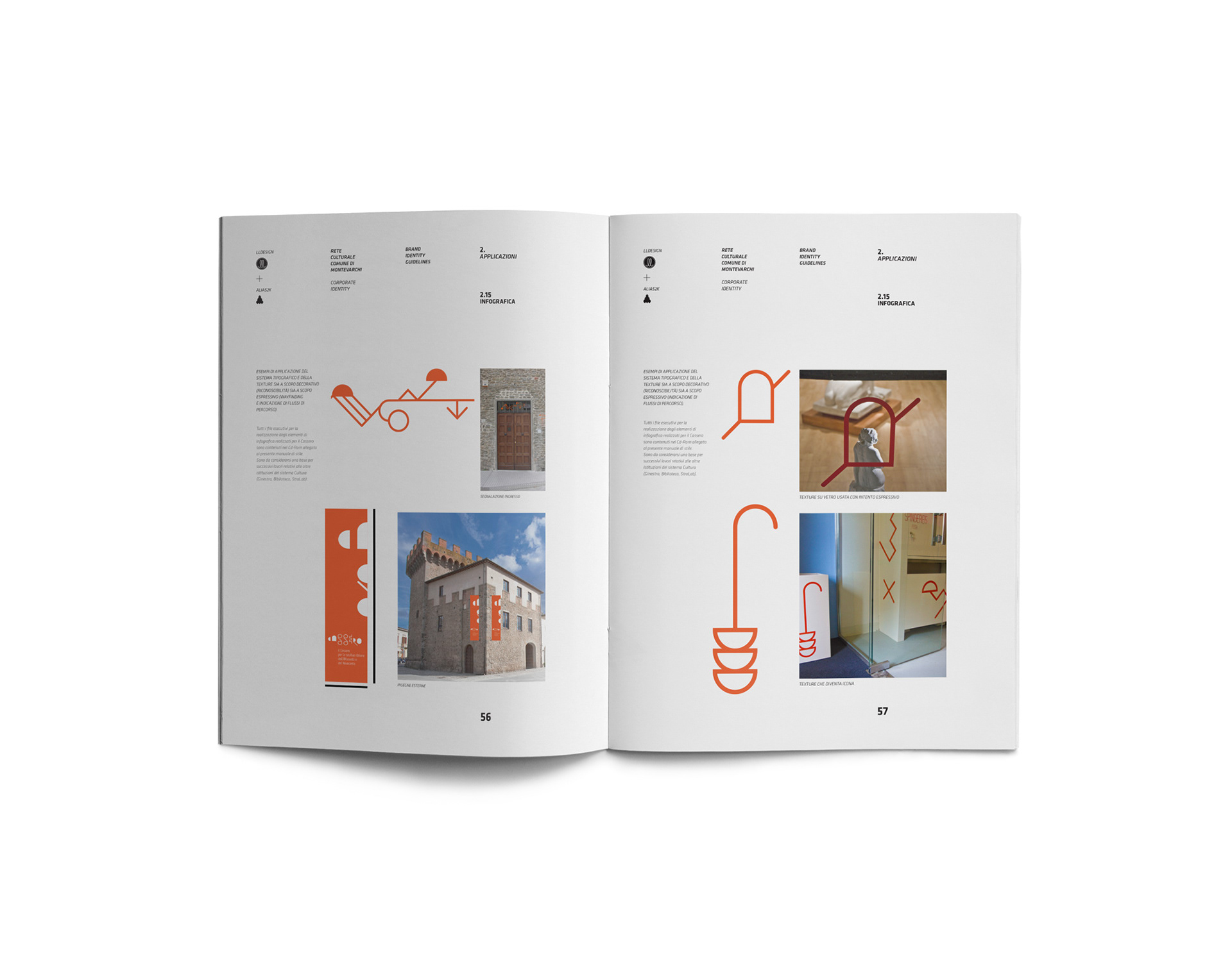
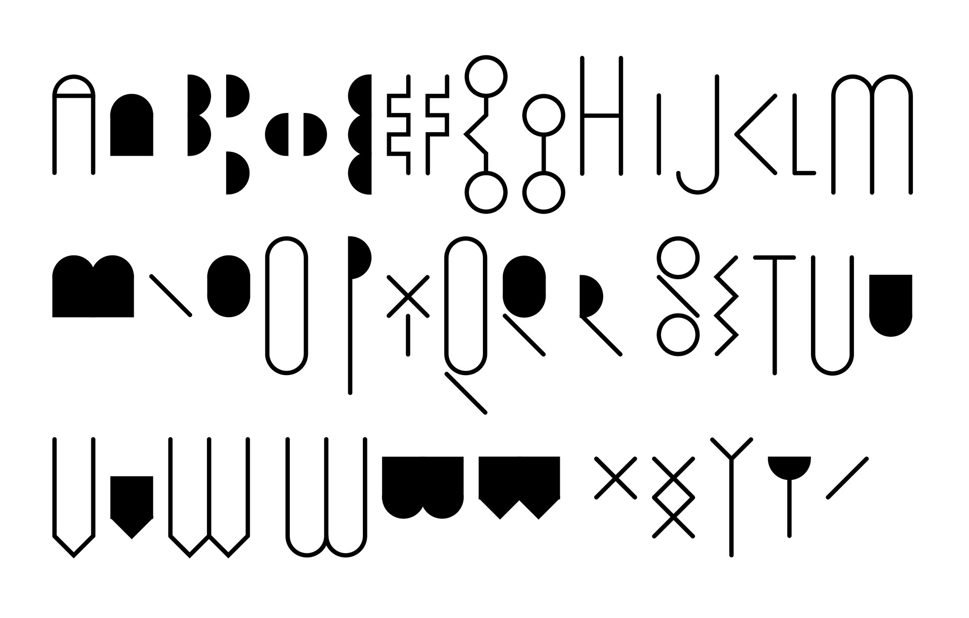
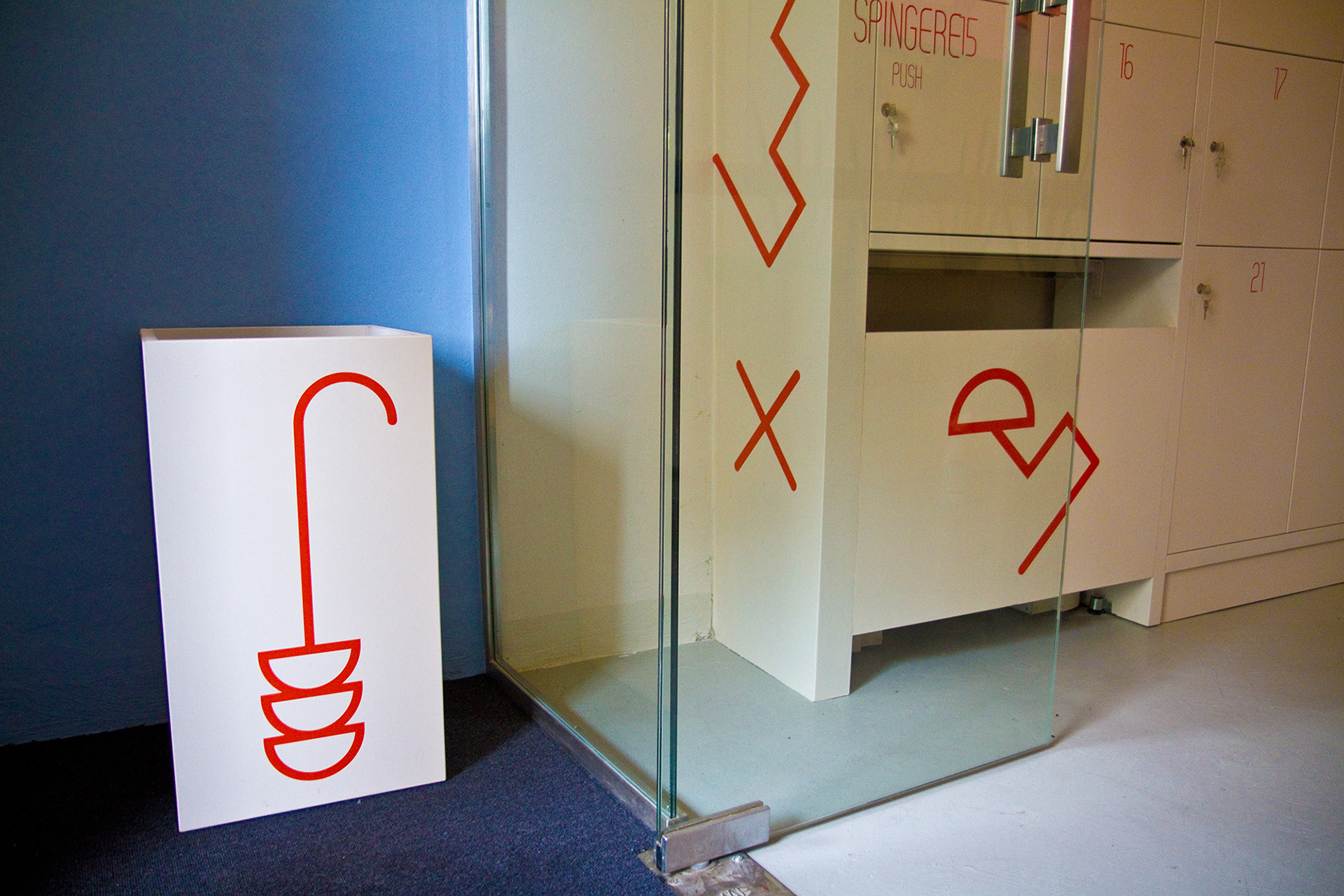
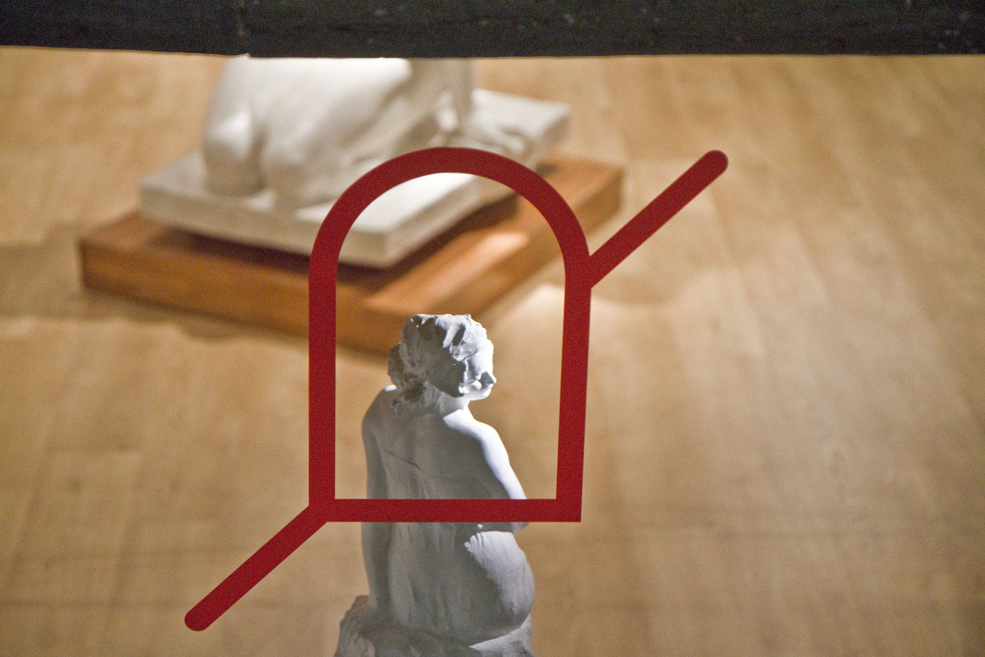
In the design you can see a number of symbols which represent the town and the architecture of Montevarchi, such as the arch, the oval which represents the layout of the town, the strong vertical lines which represent the narrow alleyways, the keys in the walls of the buildings. The symbols were then positioned on a square grid in order to develop an original style of alphabet, which has been used to create the brand and which will accompany and characterize all of the products and communicative materials connected to the cultural centre of the town. This strong iconographic identity has been used to develop a specially designed font using the same grid (OvO), which will be used for all texts and signs.
The overall effect is immediately recognizable, with a striking mixture of modernity (the sign and its use of colour) and the simple shapes which are used. The Cassero uses the logo to suggest - even if only at a subconscious level – a path to be followed, opening a dialogue between the works in the Museum and the town. The intention was to create something which would infiltrate the space but without suffocating the visitor, something which would demonstrate its strength without obscuring the identity of the masterpieces presented in museum, something which would remain in the minds of the visitor without being cumbersome.