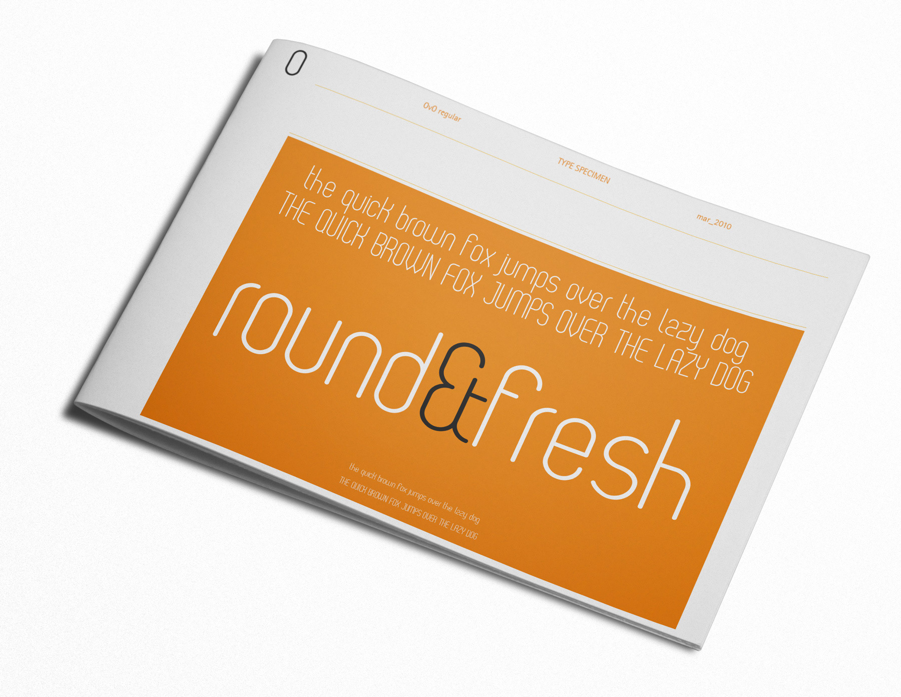
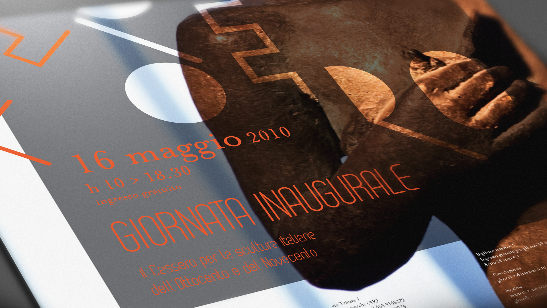
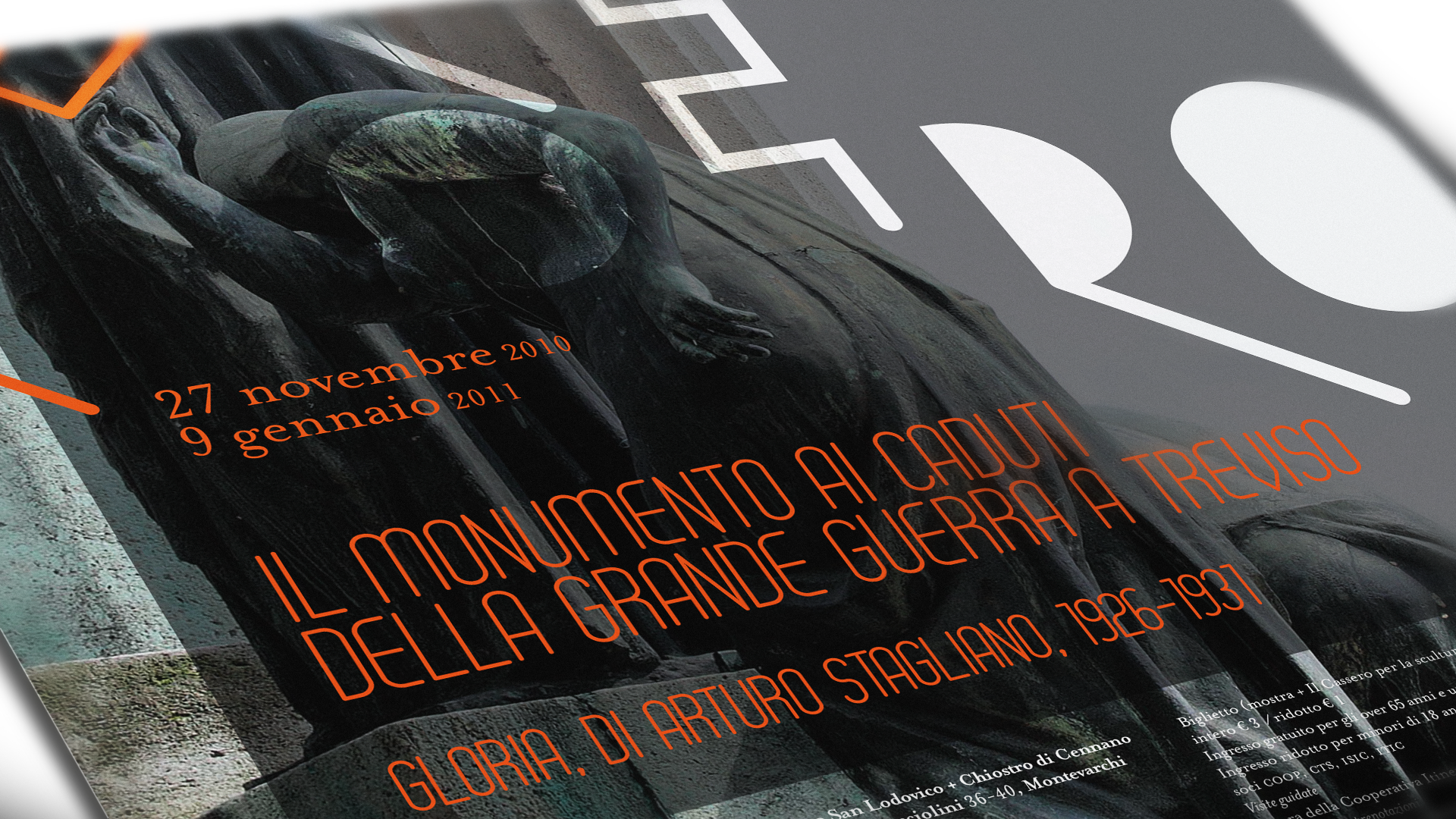
OvO is the font designed for being the main font to be used for the cultural institutions of the town of Montevarchi, Italy. The visual identity began to take shape during the ‘Dynamic Identities’ workshop held at the cultural centre ‘Cantieri La Ginestra’ in January 2010. The winning project was designed by Francesco Zorzi and Lorella Pierdicca, and went on to be developed in preparation for the when the museum was opened to the public.
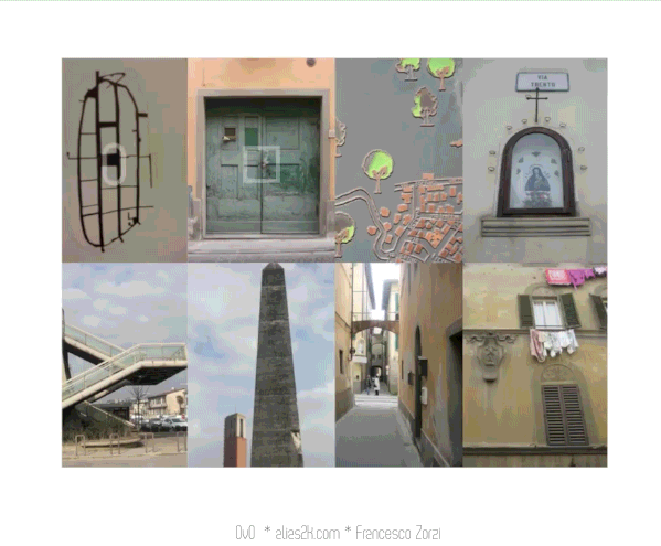
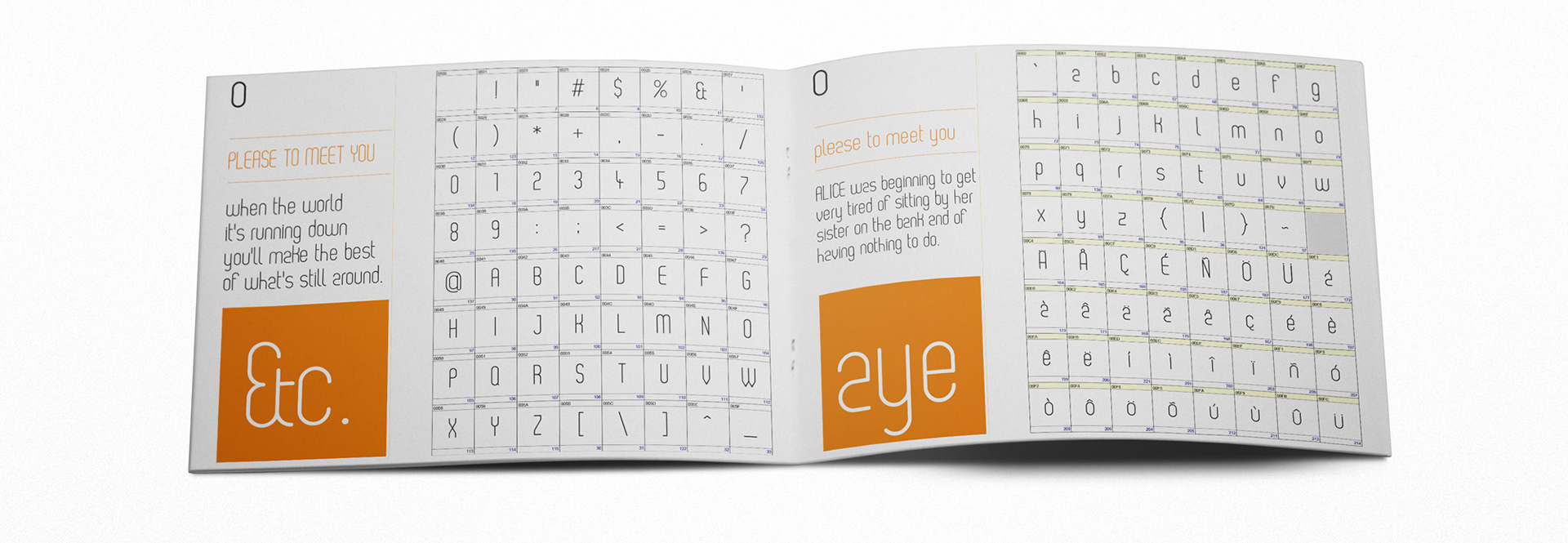
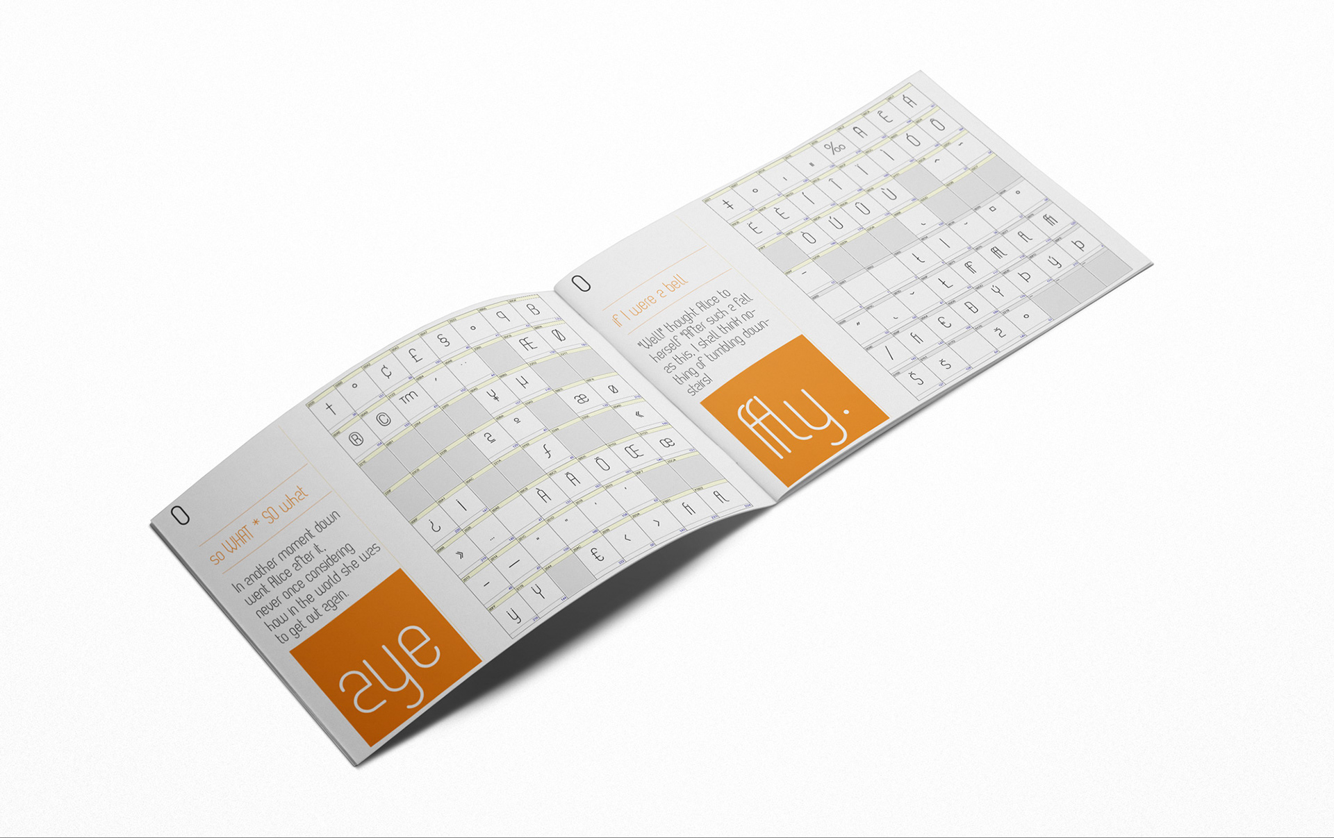
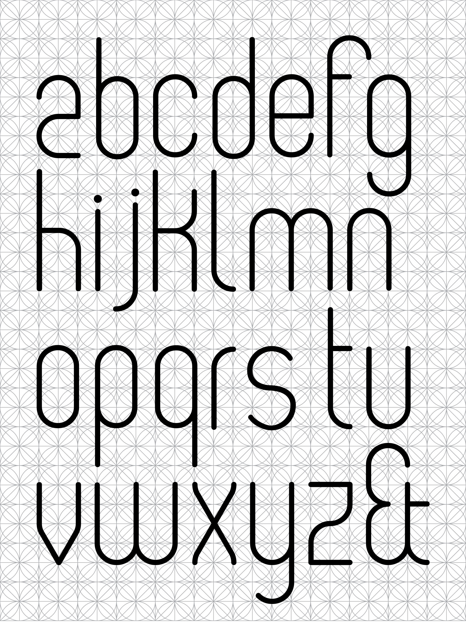
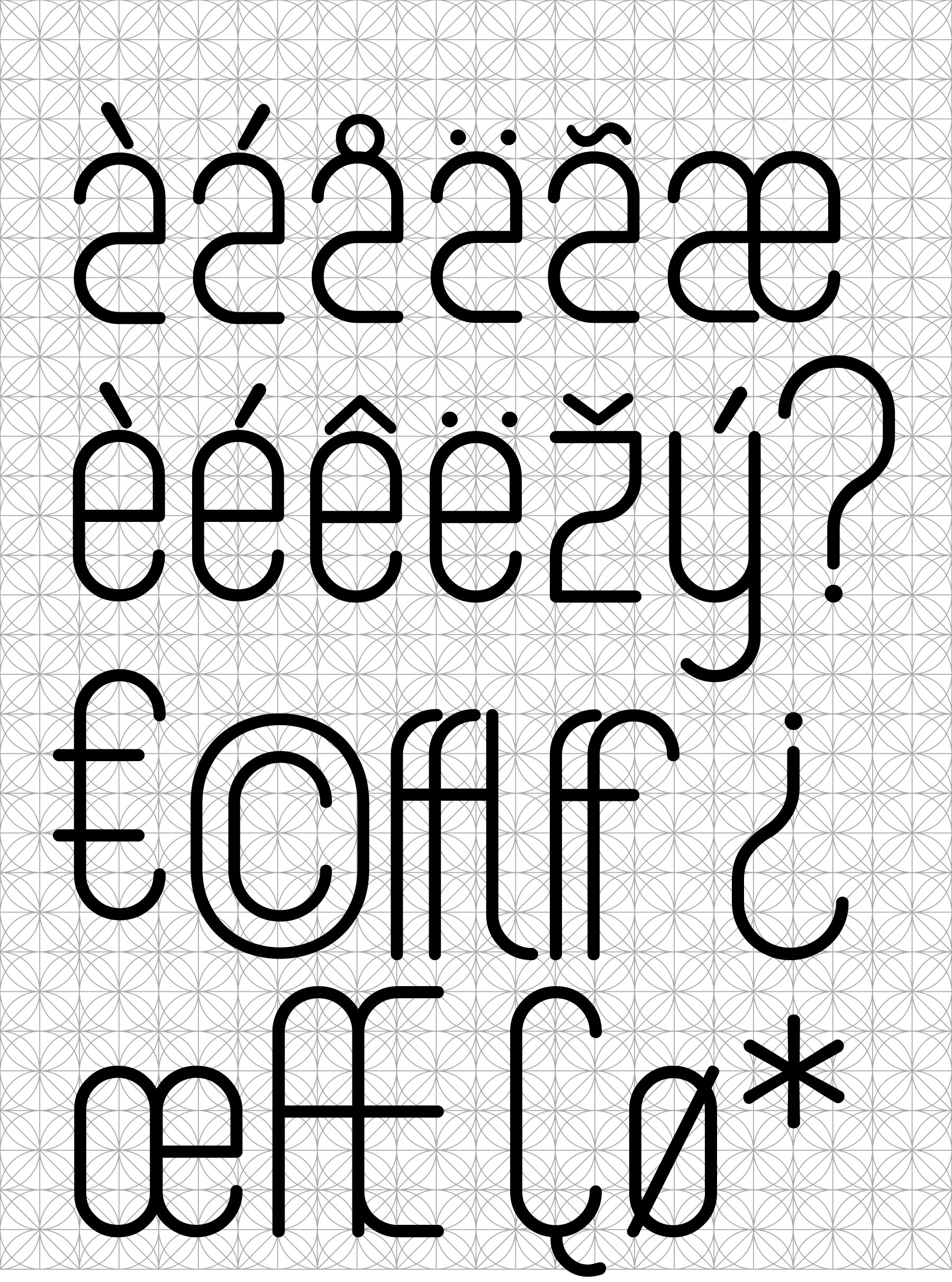
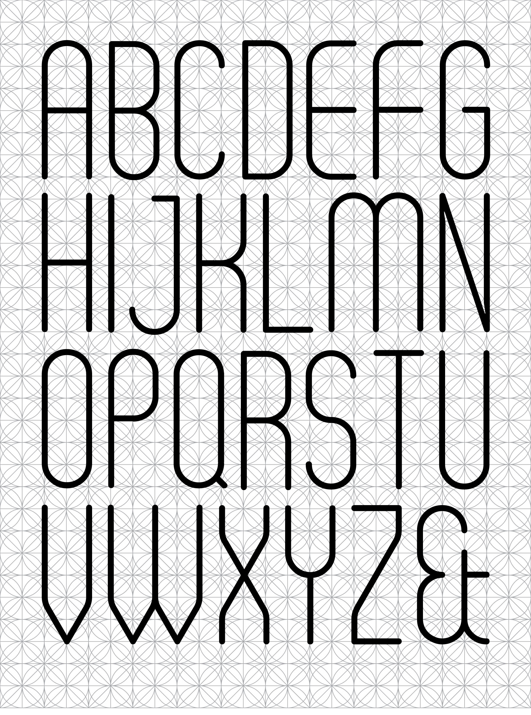
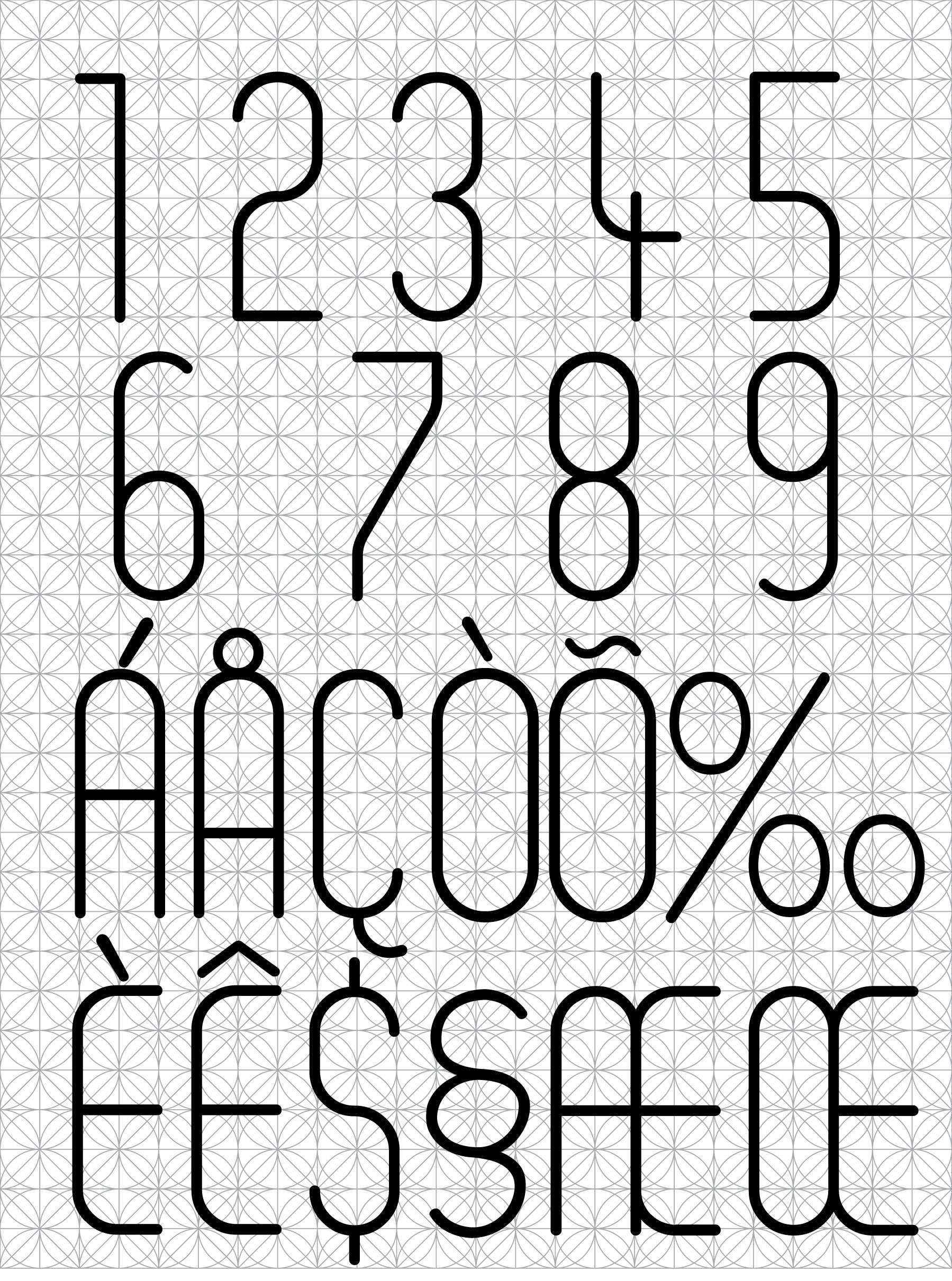
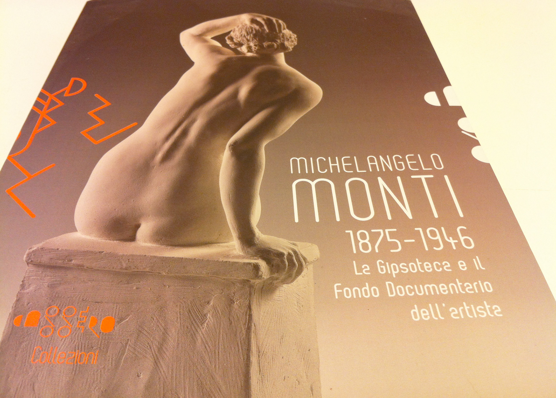
In the design you can see a number of symbols which represent the town and the architecture of Montevarchi, such as the arch, the oval which represents the layout of the town, the strong vertical lines which represent the narrow alleyways, the keys in the walls of the buildings. The symbols were then positioned on a square grid in order to develop an original style of alphabet, which has been used to create the brand and which characterize all of the products and communicative materials connected to the cultural centre of the town. This strong iconographic identity has been used to develop a specially designed font using the same grid (OvO), which is currently being used for all texts and signs of all the cultural institutions of Montevarchi.
In the design you can see a number of symbols which represent the town and the architecture of Montevarchi, such as the arch, the oval which represents the layout of the town, the strong vertical lines which represent the narrow alleyways, the keys in the walls of the buildings. The symbols were then positioned on a square grid in order to develop an original style of alphabet, which has been used to create the brand and which characterize all of the products and communicative materials connected to the cultural centre of the town. This strong iconographic identity has been used to develop a specially designed font using the same grid (OvO), which is currently being used for all texts and signs of all the cultural institutions of Montevarchi.